 Recently when traveling to New York City, I had the opportunity to fly first class. The difference between coach and first class was significant, making my flying experience extremely pleasant. Rather than feeling eager to get to my destination, it was a time of relaxation. The plane is no bigger in first class than it is in coach, but the use of the space is significantly different. Instead of three seats across, there are only two. Each seat is larger and has been designed for luxury and comfort.
It occurred to me that this is no different than the experience we have in our own homes. It’s not about the size of our homes but the way in which we fill them. There are so many things to consider when placing furniture that the correct size and scale of the pieces are often overlooked.
And then there is the flip side to this.
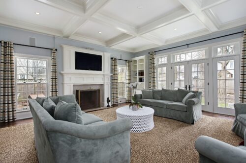
The day before my trip, I was invited to a magnificent home that was newly built and decorated. The rooms were huge and open to each other. The large windows exposed breathtaking views. But I was disappointed to see that the furniture chosen for this home did not suit the architecture. The furniture was not congruent with the grandeur of the home. The proportions were in conflict because the furniture (scale) was too small and looked as though it was brought from their previous home, which it hadn’t. This incongruity also made the furniture look dated, and out of place.
Often, we successfully ignore the architecture of a home, which can give it interest, style and individuality with color, texture and accessories. This can happen when combining periods to give an eclectic look. However, when it comes to size and scale, it is critical that the scale of the architecture not overwhelm the furnishings – or vice versa. Having too much space and too large pieces can be cumbersome to live with. Having furnishings that are too small will make your pieces look like they don’t belong.
Another misunderstanding of space is when every inch of wall space is filled, which brings the perimeter of a room in to make it appear smaller. This happens when every wall has a picture on it or a small wall area has a picture that is too large for the space. Just because there is a wall you must hang something on it. As a matter of fact, it is important that there be empty spaces in between your art, so your eyes can rest and better appreciate the pieces that are displayed.
When I was in New York, I visited several people who live in apartments. I was surprised at how little space there was to keep things that weren’t absolutely essential. Yet they made it work for them.
Space — too much or too little – is something we must consider. Are we using it to its best advantage?
One of the first considerations when beginning a project is good space planning. Consider the space you have, then fill it with what works for you. Then, of course, decide what looks good. All this must be successfully integrated with the architecture. Then we will have created a successful space.
For our well-being we must feel good in all our spaces, so remember, rooms have no feelings, YOU do.
Watch for Space II – Your Personal Space next month.
Barbara Kaplan, creator of the Bajaro Method of Interior Design offers personal interior design consultations for guidance, ideas, and solutions to make your home truly yours. Contact her at Barbara@BarbaraKaplan.com